How do you create a brand that encapsulates an entire city? Making a destination economically and culturally attractive through a visual identity is no small feat. It has to do a number of seemingly contradictory things: it should be clear but subtle, universal but unique, instil a sense of belonging in residents but have a global appeal – all while standing the test of time.
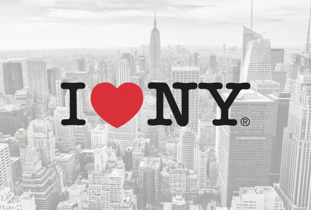
And it’s an emotional matter. The recent rebranding campaign for New York City, led by Founders, took the iconic I ❤ NY symbol designed by Milton Glaser in the 70s and applied small changes – a different pronoun, a sans serif font and a 3D graphic heart – that sparked a huge global reaction. Many called the WE ❤ NYC campaign a failure, while others got behind the inclusive message and modernised design.
With so many design elements, stakeholders and views to consider, is there a recipe for creating a successful city brand? The ingredients depend on the vision. Marketing specialist Maryam Banikarim, who ran the NYC campaign, says it’s all about purpose. “Clearly understanding your goal and who it’s for matters.” The aim of the rebrand was to infuse pride in New Yorkers and “drive civic action” by encouraging citizens to volunteer in their communities. “This is a moment for ‘we’ not ‘me’,” she explains. “The campaign isn’t trying to replace the original mark; it’s designed to exist alongside it and bring NYC residents together. Whether you love the mark or hate it, do something for your city.”

“There’s no culture yet, there’s no people yet. We have to create our own image through the design”
Diaz Hensuk, the Indonesian Association of Graphic Designers’ board of advisors
In his book City Branding: Theory and Cases, Keith Dinnie claims that a strong place brand should identify a clear set of attributes that “powerfully express the unique character of the city”. This was the approach behind the rebrand of Christchurch, NZ, which launched last month. Following the 2011 earthquake that damaged much of its infrastructure, the city needed to “find its new identity with a big ‘I’”, says Jeremie Feinblatt, vice president of strategy at Resonance Consultancy, who worked with economic development agency ChristchurchNZ to produced a fresh narrative aimed at attracting external groups to visit and invest in Christchurch.
Jeremie and his team spent time in the city to understand its “soul”, and conducted surveys that asked thousands of businesses, residents and visitors about their aspirations and perceptions of Christchurch. They discovered that its image as the “Garden City” was important, as well as being a good place to balance work and leisure, leading them to create the promise: “Christchurch is a playground for people.” Jeremie calls this process “from logic to magic” and argues that it created a strong value proposition to differentiate Christchurch from other destinations.
Drawing on a city’s history works for rebrands, but what if the city doesn’t yet exist? Working with the government, the Indonesian Association of Graphic Designers (ADGI) is helping to create the visual identity work for Nusantara, Indonesia’s newly planned capital city, which will see the capital move from Jakarta to the island of Borneo. It is set to be inaugurated next year, and urban planners and architects have designed the landscape, but the physical city is still being built.
“Your brand has to align with the values shared by the community and reflect their reality.”
Jeremie Feinblatt, Resonance Consultancy
Starting with a blank canvas is one of the main challenges, says Diaz Hensuk, who sits on ADGI’s board of advisors. “There’s no culture yet, there’s no people yet,” he says. “We have to create our own image through the design.” The narrative ADGI has devised seeks to present Nusantara as “a home for all” to meet the government’s professed aims of promoting economic equality and inclusivity, and decentralising the country by shifting the focus from the dominant island of Java.
The association invited its members across the country to participate in the logo-making by submitting their own designs. There were 500 submissions in total, which were then painstakingly whittled down to five finalists, with the winner voted for by the public. The winning designer, Aulia Akbar, was announced just yesterday by Indonesian president Joko Widodo; his logo is called “Pohon Hayat Nusantara” (Nusantara’s Tree of Life) and was inspired by the symbolism of trees from west to east Indonesia, representing the rich biodiversity in Indonesia’s ecology.
The aim of the competition was to “create a sense of ownership by allowing people to be part of Nusantara’s development,” says ADGI communications director Primo Rizky. “It’s like a design election, democratising design through the public.” A collaborative method that seeks input from local groups is vital to branding a city, says Jeremie from Resonance Consultancy: “Your brand has to align with the values shared by the community and reflect their reality.”
Resources
https://www.itsnicethat.com/features/branding-a-city-graphic-design-branding-thematic-310523